Art Direction
UI Design
Logo Design
—UI Designer —Creative Director
Sowing the Seeds
The Primary Goal was to enhance the user experience by simplifying navigation, optimizing the product discovery process, and building an interface that reflects the brand’s commitment to natural and effective skincare.


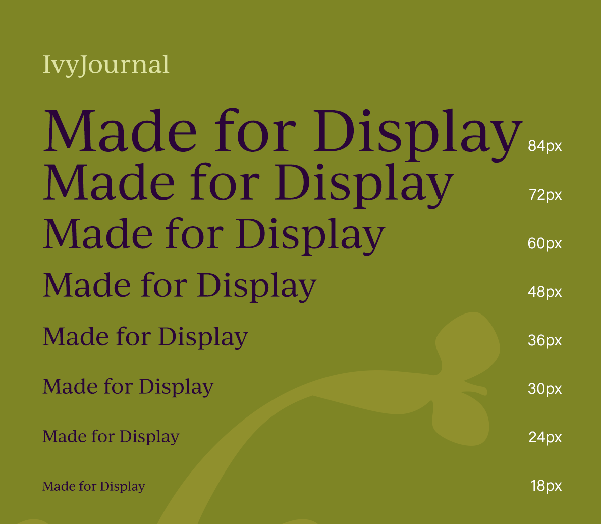
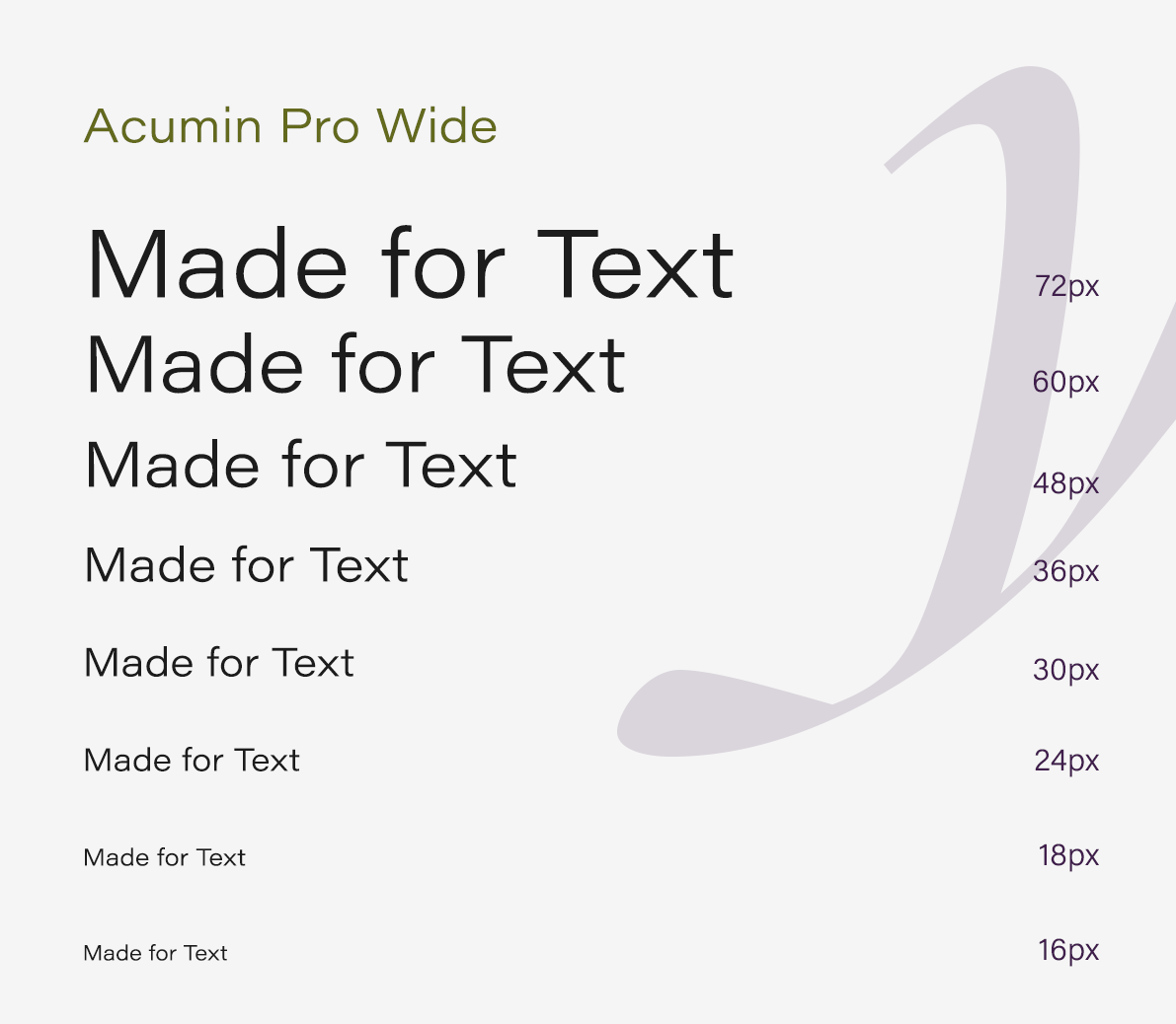
Building a Visual Brand
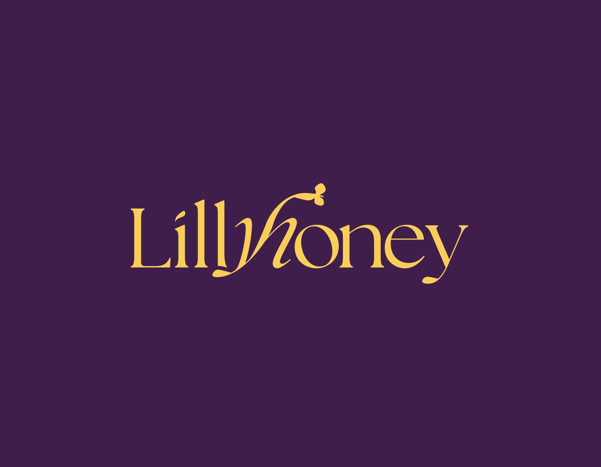
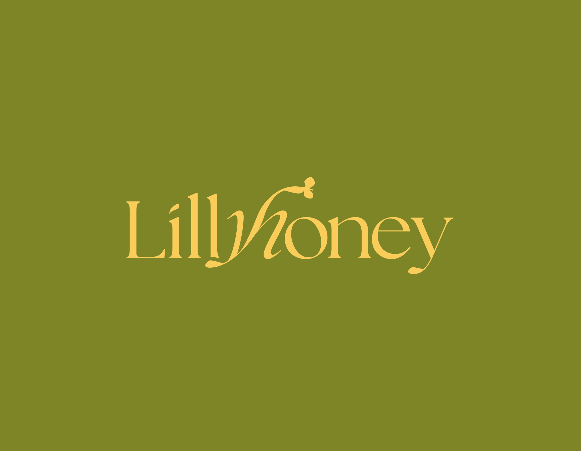
The name "Lillyhoney" just feels like a perfect fit for an upscale skincare line, doesn’t it? "Lilly" gives off this elegant, fresh vibe—like beauty in full bloom—and it instantly makes you think of something pure and delicate. Then there’s "honey," which feels warm, natural, and nurturing, like that go-to ingredient you trust to heal and hydrate. Together, it’s classy yet approachable, and it kind of whispers, “Your skin deserves this.”
Creating the Blueprint
During this stage, I focused on designing a system that allows users to easily navigate to related site sections from most pages, reducing decision fatigue. Additionally, I implemented clear and readable disclosure widgets to maintain a minimalist aesthetic.
The Results
Whilst keeping that in mind, the main challenges were: ensuring UI stay minimalist yet informative and implementing personalized recommendations for seamless user experience. To address these challenges, I focused on balancing visual simplicity with clear, concise information while maintaining an intuitive layout. User feedback was instrumental in refining the recommendation system, ensuring relevance without overwhelming the interface. Ultimately, the final design achieved a clean aesthetic while enhancing user engagement through smart, unobtrusive personalization.
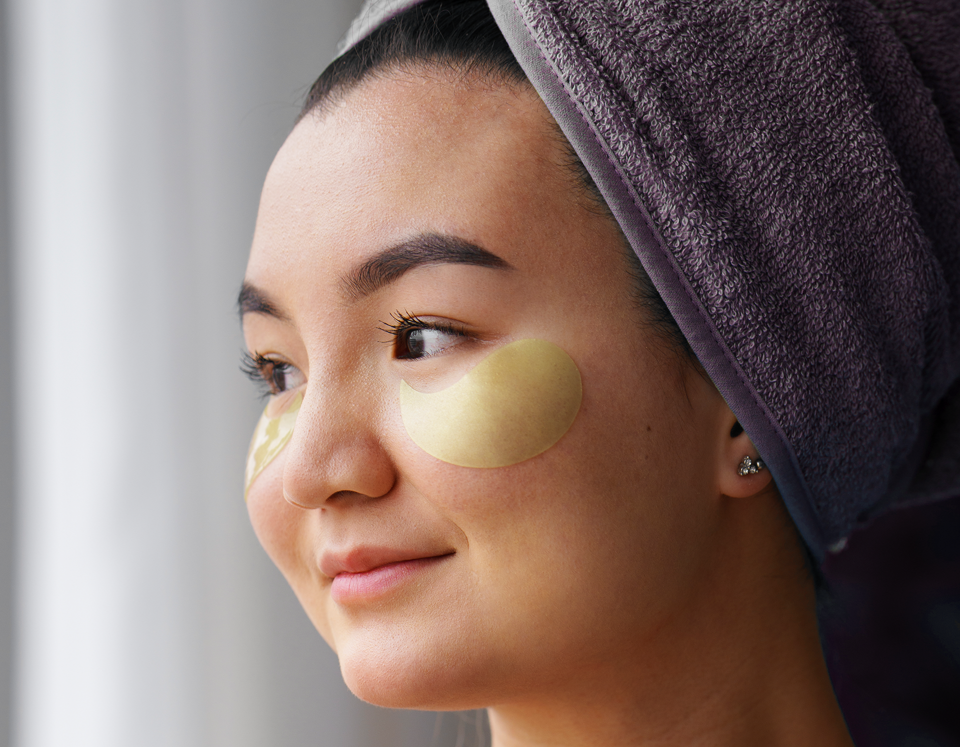
Photography and artwork by Freepik


